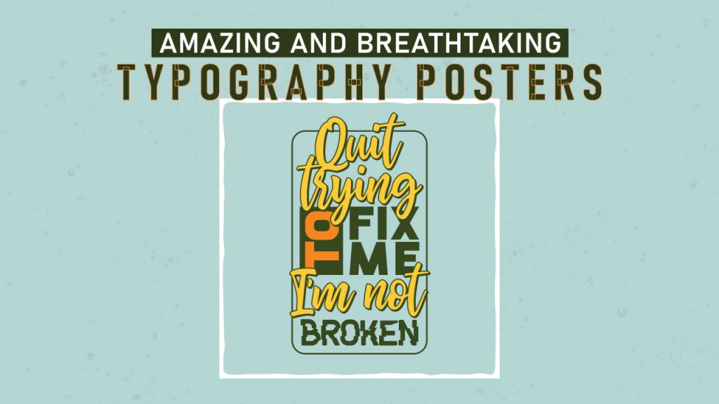
Amazing Typography Posters – Your Best Marketing Tool
Promotion of an idea, an event, a movie, or a product requires compelling messaging and effective communication. The communication cannot be too direct as it won’t reach most of the intended audience. Nor can it be too vague for obvious reasons. If the primary communication is surrounded by too many distractions or elements that do not relate to it, it may also lose its potency. How you deliver the message also has its impact.
Typography Poster Design is an often-overlooked art. To develop competent, eye-catching marketing materials, however, you need to have a sound understanding of several basic typography design concepts.
And The Medium
Typography Posters are a compelling model of delivering a key message – about your idea, brand, music festival, movie, services, or products; just about anything. You may have diverse needs for posters – for advertising or to pass information or even participate in a competition – the key to a successful text-only posters design is to get the messaging precisely on the point. Creative Poster Templates designs draw your audience’s attention and convey the key messages very quickly with very high viewer recall value.
At PhotoADKing, our creative and communications design team does not design posters from templates – everything we do is from typography poster layout to their design is cent-percent bespoke. Our communications managers ask you for an accurate and complete briefing in a form to help us know your exact objective, message, audience, requirements, tastes, and preferences. We build an understanding of what you want your best typography posters to achieve and chart a course of action to follow from initial sketches to layouts, themes to colors, etc.
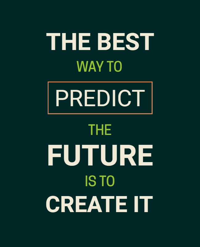
Usually, the simple typography posters are the best ones as they convey a single idea or single key message. Such posters have generally associated images, helpful illustrations, and attractive infographics in poster designs. These graphics, when woven together with our hand-drawn typography poster design, all come together to create a poster that is stunning, breath-taking, and conveys your message.
The Best Designs Are The Simplest
To make a great poster, amateurs usually add too many elements and forget that being simple is the most attractive feature admired by the most. A designer should not over design a poster by trying to fit too much information or too many elements. It can end up conveying nothing or even misleading information!
Depending on your needs, our designers work on initial cool typography posters designs to make the on-brand; we will need your existing marketing material. This ensures that our designs fuse and work with the rest of your marketing communication – we will provide you our typography sample to assess the same. Depending on our analysis and inputs from you, we may choose a swiss typography posters design or a vintage typography posters design or some other theme from our vast collection.
Posters For Any Occasion, Any Size, Any Location
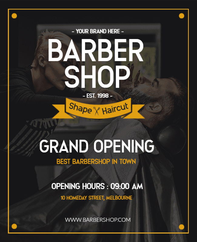
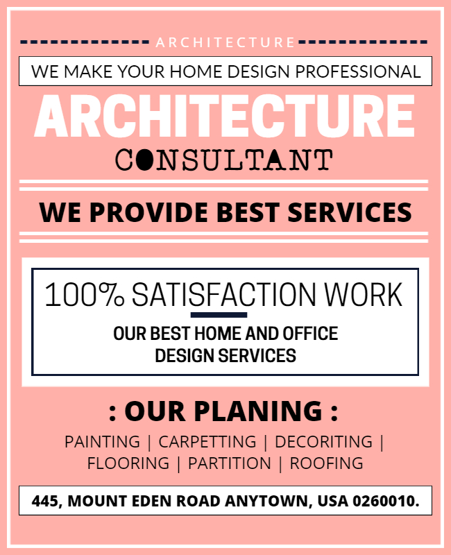
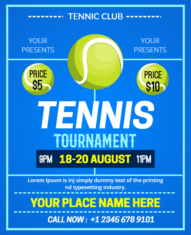
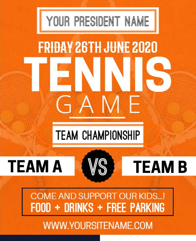
Posters are used as signboards, as pinups, for inspirational quotes, as hoarding outside stores, as standees at festivals, billboards, or to be hung against a large wall. They are used at festivals, at stadiums, at campaign rallies, at music concerts, at movie and drama theatres, in schools. These posters are available in all sizes – from a simple leaflet or flyer to the largest hoardings or billboards.
At PhotoADKing, we understand that designing for every occasion, size, and audience is different and needs to be treated so. For example, large-format designs are inherently different from the designs of a brochure or leaflet or a standee or pinup. The attention to detail, longevity, time to consume, ease of carrying it, the arrangement of elements, everything changes with size. You cannot “zoom” the designs as per your needs. For typography advertising posters to be used on billboards, as everything tends to be larger, layout and typography must be given more attention. What we see on a small screen can look different when produced at A2 or larger sizes.
The Best Poster Designs For You, Always
Whether you need small A3 posters or large-format artwork, our creative typography posters design team has the best designs. They have created hundreds of award-winning typography posters and make sure that your posters are also as original and productive.
Poster designs look great in print, no doubt about that, but you should never forget digital. Our designers create interactive and animated versions of your posters, with a call to action and animations, to share with your digital and social media campaigns. This way, you ensure comprehensive online and offline marketing coverage consistently and maximize the exposure for the event, product, or service.
Effective Poster Design Principles
Laypersons think that typography requires only selecting a font, its style, size, and whether it should be regular or bold. But there is much more to it – intricate details that give the total designer control over their designs.
- Clarity: For a poster to be attractive, it needs to be precise. Use three or fewer fonts in a poster and avoid more than that. Multiple fonts result in a baffled reader. Avoid tweaked fonts with hard to read letters (like Brush Script or Gigi), except when there is a compelling reason to do so. Simple is best; always remember this rule. White and bright space between letters and words improves clarity and adds balance to design.
- Serif vs. Sans-Serif: Fonts with an accent pointing from every character are serif fonts and can be an excellent heading. A serif font provides titles a vintage and authentic look to get more attention. The sans-serif fonts convey a more modern, clean, and neat look. Sans-serif fonts are simpler to express in smaller sizes and are great for brochures, leaflets, and pinups.
- Space Out Judiciously: The white space between the lines and letters/characters affects if the message is on the spot or confusing. Too much of leading means too few words, and too much of it means lines are too tight and hard for reading. Similarly, the space between character, or kerning, affects the clarity of the message.
- Get Those Quotes Correct: Great quotations need excellent presentation. Curled quotes are preferred for improved readability. Our designers add curled quotes by hand in your poster design at the most appropriate locations. Hanging quotes are also an excellent way to present the idea and keep the left alignment intact and balanced.
- Posters Themes: We have categorized our poster design into broad themes based on the look and feel they convey and use. Some of the most popular ideas that we use are listed here for your reference:
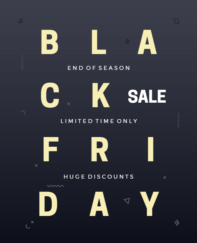
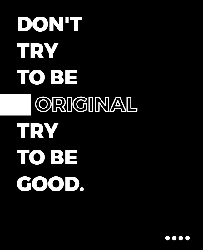
a. Minimalist typography poster: these posters contain the minimum amount of text and a minimum number of elements. They are very sharp, bright, crisp, and have neat fonts. They are handy as signboards, to associate your logo with a single word or idea or color.
b. Vintage typography poster: Use of gothic elements, royal signage, seals, royal figure, and architectures along with Latin-faced fonts, give a vintage and classic look to your posters.
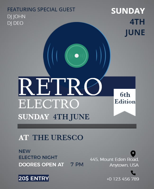
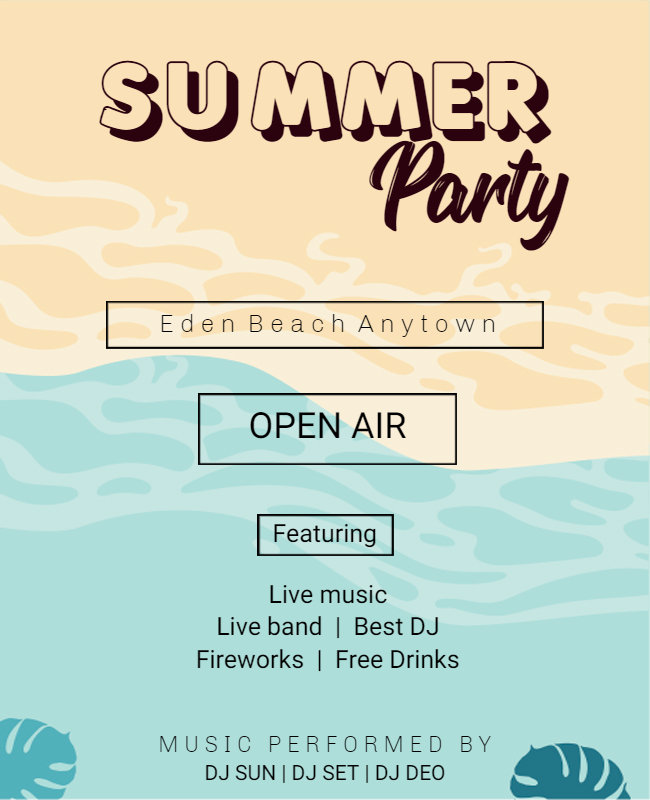
c. Retro Typography Poster: Use of color, iconography, and symbols from the 1930s to 19780s give your posters a retro-hip look. They are best suited for parties, festivals, movie promotions, album releases, literature festivals, etc.
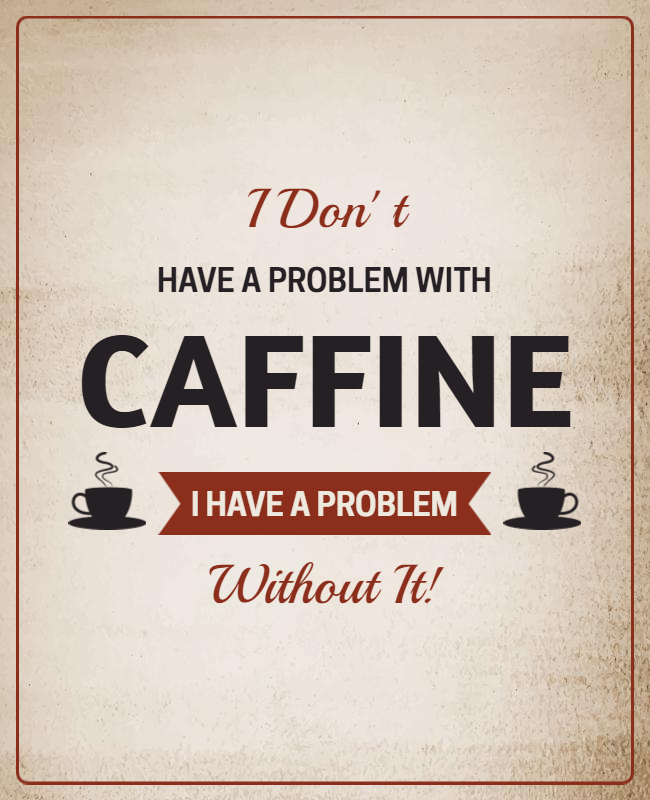
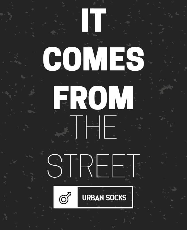
d. Black and White Typography Poster: for some posters, the use of black and white is the best color combination you can ask for. Especially in fashion, social or campaign messaging, brand promotion, and showing a stark difference through contrasting areas of black and white. Sometimes a single small element with only one color is added to make it more potent.
e. 3D Typography Poster: Posters that look 3-dimensional and look different when seen from different angles are also in demand. These posters are very occasion specific and are for a minimal niche audience.
f. Nature Theme Posters: The best designer around is mother nature. As designers, we know that, take inspiration from it and use natural elements in posters for environmental conservation, earth day message, saving all lives, and other such messages.
g. Outer Space Theme Posters: The outer space offers vivid elements to work with – a vast black space, galaxies, stars, solar system, big bang, and many more. This theme can add fun quotients. Some designs are effortless and clean, while many use vibrant, bright, and bold colors. The contrast makes all designs look exceptional and outstanding.
Poster Design For All
PhotoADKing has served fabulously designed posters for all needs and all types of clients. Some of our clients have been as diverse as a school and a night club.
| Music Concerts | Apparel Stores | Auto Shows | Bakers and Confectioners |
| Hotels & Resorts | Banks, Insurance & Finance Companies | Landscaping Services | Planetariums & Science Fairs |
| Education – Schools & Universities | Electronics Stores | Gymnasiums & Fitness Centers | Salon, Spa and Sauna Services |
| Photography Studios | Real-estate Agencies | Hospitals and Medical care providers | Restaurant & Eateries |
| Sports Events, Teams and Stadiums | Night Clubs | Artists, Art galleries | Museums |
Why Choose PhotoADKing for typography poster designs?
- PhotoADKing provide 24×7 attentive support
- With PhotoADKing custom-made poster, you get the wow factor
- Its experienced team suggests themes to speed up the overall design process with Poster Maker
- Get your posters for all occasion, all venues and in all sizes
- The same posters can be delivered in multiple fonts, colors, size, and layout options